Design System Management File

Design System
Management File

Design System Library

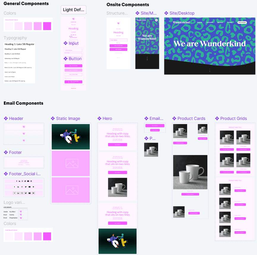
At Wunderkind, I developed a comprehensive design system management file in Figma that transformed our entire design workflow. This system featured a preset Variables Library, customizable templates for onsite experiences including top bars and pop-ups, and templates for five distinct email campaign types with dozens of modular components designed for seamless mixing and matching. The system empowered designers to efficiently populate client experiences with unique branding while ensuring visual consistency across all touchpoints. As a result, we reduced our new client onboarding timeline by a full day, while simultaneously creating more opportunities for designers to explore creative and experimental approaches in their work.

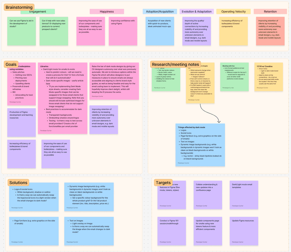
I collaborated closely on this project with Amy Boys, a talented Visual Designer from our London office. Amy and I connected weekly via Zoom to brainstorm concepts, discuss project progress, troubleshoot challenges, and share insights. The core development phase spanned three months, with additional enhancements implemented after our peers completed the corresponding client-facing Figma file. You can learn more about Amy and explore her portfolio by following this link.

April - June 2024

Project Overview

The Product

The Product

The Internal facing client file in Figma that designers used to onboard new clients and design continuing client work was limiting design freedom, components were not being used in final layouts, and Typography and Color libraries were not linked throughout the file. This resulted in inconsistencies in designing both onsite and email campaigns and caused the onboarding process to be lengthy. Figma had also added two new tools, Dev Mode and Variables Library, that were not yet being utilized.

The Internal facing client file in Figma that designers used to onboard new clients and design continuing client work was limiting design freedom, components were not being used in final layouts, and Typography and Color libraries were not linked throughout the file. This resulted in inconsistencies in designing both onsite and email campaigns and caused the onboarding process to be lengthy. Figma had also added two new tools, Dev Mode and Variables Library, that were not yet being utilized.

The Goal

The Goal

Our vision was to build a new kind of design tool—one that is designed for the entire Professional Services team, from designers to developers, that could also connected to client facing files to be used by Client and Implementation Managers.

Our vision was to build a new kind of design tool—one that is designed for the entire Professional Services team, from designers to developers, that could also connected to client facing files to be used by Client and Implementation Managers.

The Project

The Project

Using Atomic Design Methodology as our guiding principal, we produced a Variable Library that could be quickly filled out by designers, dozens of interchangeable modular blocks for email campaigns—each with customizable variants, and finished layout components for both onsite and email experiences that could be pasted into client facing Figma files.

Using Atomic Design Methodology as our guiding principal, we produced a Variable Library that could be quickly filled out by designers, dozens of interchangeable modular blocks for email campaigns—each with customizable variants, and finished layout components for both onsite and email experiences that could be pasted into client facing Figma files.

Building the Libraries

Building the Libraries

Variables Library

We developed a comprehensive Variables Library template encompassing all design elements that Wunderkind Visual Designers utilize when adapting client branding guidelines for performance marketing campaigns. The template systematically organizes client-specific assets including color palettes, typography specifications, CTA button interactions, and input field parameters. To address GDPR compliance requirements, we incorporated Boolean variables that enable designers to ensure all creative outputs meet applicable legal standards. By establishing a template library pre-configured with essential variable types, we significantly streamlined the client onboarding process and reduced setup time for new campaigns.

Onsite Experiences Style Setup

Onsite Experiences Style Setup

As the Variables Library is filled out with the Client’s branding Style Guidelines, the colors, dimensions, and styles are auto populated onto the elements within the components frame. From here the designer can make needed changes such as updating the color variable assigned to the heading text from primary text color to accent text color to correlate with the client’s branding.

Text Styles

Text Styles

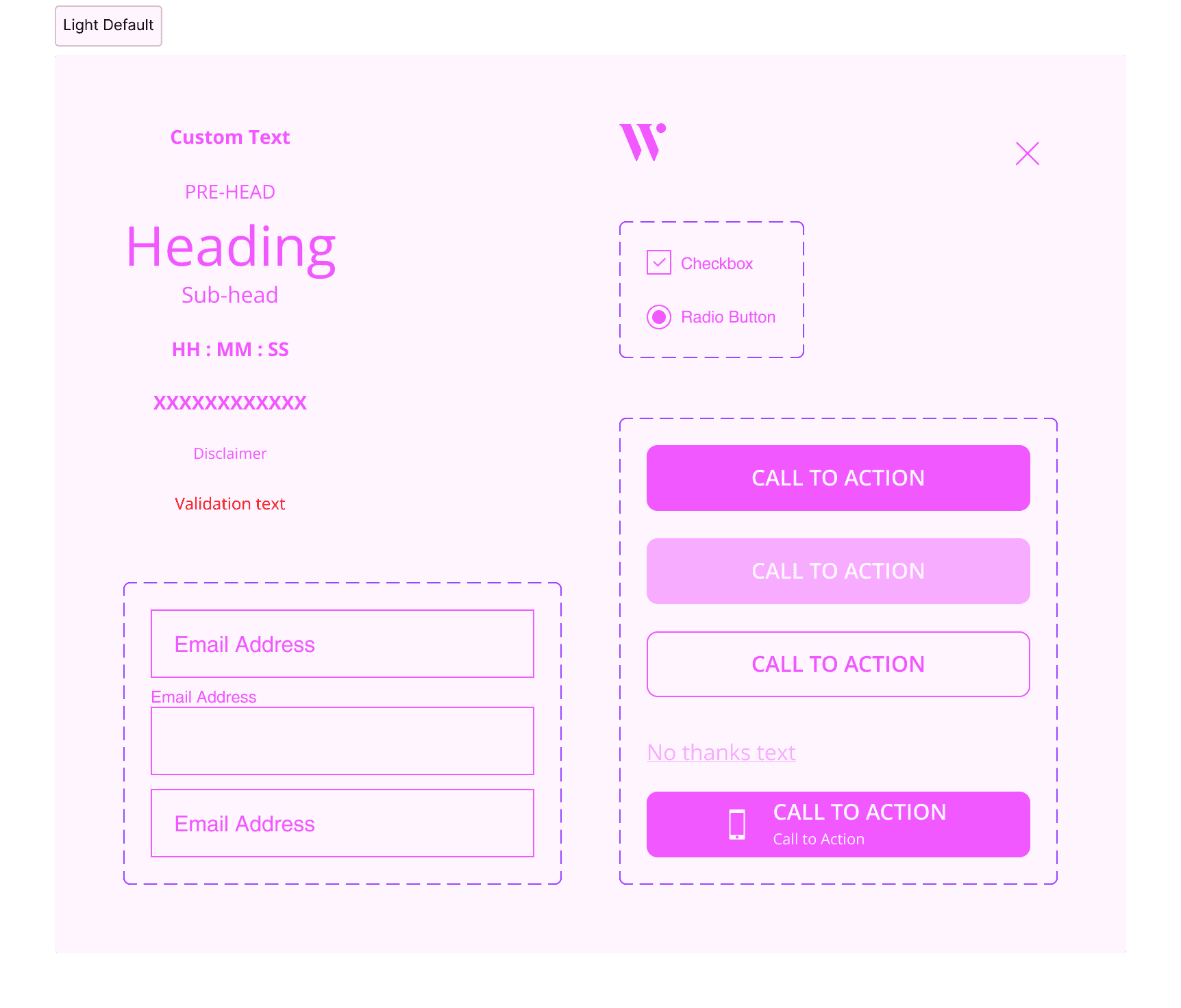
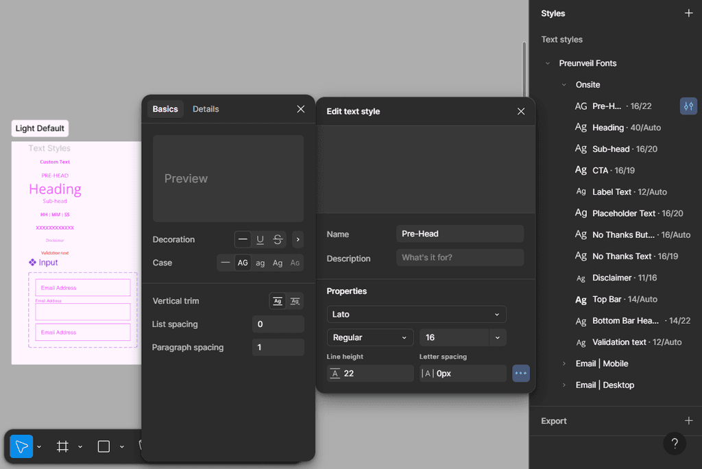
A Text Styles Library has also been preset for designers to complete the Client’s brand fonts and type styles. The designer completes the different typographies with the correct font, case style, and weight--size, line-height, and letter spacing are set in the Variables Library. The text styles flow down to the elements on the components frame as well as to the experience layout frames.

Onsite Experiences

Onsite Experiences

Campaign Types

Campaign Types

The pre-set campaign types include, overlay pop-ups, bottom bars, top bars, corner tabs, and toast buttons. The components and elements within each frame are pre-linked to the Variables Library and the Text Styles. Because the designer has completed both of these things in advance, the onsite campaign frames will have been auto populated with the Client’s unique branding styles. From here the designer can make small changes such as rounding the edges and adding lifestyle imagery, or large changes such as changing the rectangular shape of the popup to brand specific shape such as a apple for Apple Vacations, or the shape of a diffuser for Vitruvi.

Toggle Modes

Toggle Modes

The Variables Library incorporates two distinct modes—light and dark—to optimize visual hierarchy and contrast across different campaign elements. For clients with light-themed websites, designers leverage the dark mode to create high-contrast pop-ups, bottom bars, and top bars that utilize darker tones from the client's brand palette. This strategic contrast approach ensures these key conversion touchpoints stand out prominently from the primary website background, enhancing visibility and user engagement. The dual-mode structure allows designers to maintain brand consistency while maximizing the visual impact of critical customer capture experiences.

Toggle Components

Toggle Components

By configuring these dual modes within the Variables Library and populating them with client-specific values, designers gain access to Figma's native mode-switching functionality through the Appearances dropdown menu. This setup enables real-time toggling between dark and light style variations, allowing designers to instantly preview and compare both aesthetic approaches within the same design frame. The immediate visual comparison empowers designers to make data-informed decisions about which styling approach will most effectively support each client's unique marketing objectives and conversion goals.

Email Experiences

Email Experiences

Email Campaign Styles and Components

This variables-based approach extends seamlessly to email campaign designs, where all core components, including logos, copy, icons, and buttons, are linked to the same dual-mode variable system. Designers can instantly toggle between light and dark styling variations across entire email templates, maintaining visual consistency with other campaign touchpoints while evaluating which aesthetic approach optimizes engagement for each client's audience. This integrated workflow ensures cohesive brand execution across all marketing channels while providing the flexibility to adapt email designs based on performance considerations and client-specific strategic requirements.

Modular Component Mix-and-Match Blocks

Modular Component Mix-and-Match Blocks

I took the pre-existing email block templates and broke the blocks down to individual components, applied the variables styles to the components, then built the modular blocks back up using the components. I also created new blocks such as product cards with review content and additional top categories layouts. Each block is a variant of a component group. This allows the designer to paste a component type into an email campaign layout and then toggle through the variants to find the right style for that client. As the designer updates the Variables Library and Email Text Styles, colors, shapes, and styles are automatically changed within each modular block.

Welcome Emails

Welcome Emails

Welcome emails serve as the introductory touchpoint between subscribers and a client's brand, establishing the foundation for ongoing engagement. The email modules should strategically emphasize brand identity and voice, encouraging users to familiarize themselves with the brand's core values while guiding them through the conversion funnel to complete their purchasing journey. To optimize performance, designers employ concise storytelling techniques paired with high-quality evergreen lifestyle imagery positioned both in the hero section and throughout the email body. The default body layout features a three-section block structure that narrates the client's brand story in a journey-like progression. Alternative block configurations provide templates for founders to share their personal narrative in a letter format, adding authenticity and personal connection to the brand introduction.

Welcome emails serve as the introductory touchpoint between subscribers and a client's brand, establishing the foundation for ongoing engagement. The email modules should strategically emphasize brand identity and voice, encouraging users to familiarize themselves with the brand's core values while guiding them through the conversion funnel to complete their purchasing journey. To optimize performance, designers employ concise storytelling techniques paired with high-quality evergreen lifestyle imagery positioned both in the hero section and throughout the email body. The default body layout features a three-section block structure that narrates the client's brand story in a journey-like progression. Alternative block configurations provide templates for founders to share their personal narrative in a letter format, adding authenticity and personal connection to the brand introduction.

Category Recap Emails

Category Recap Emails

Category Recap emails enable clients to re-engage subscribers who have demonstrated site engagement but departed prior to adding products to their cart. Image selection and design decisions for category recap emails should prioritize brand affinity development and relationship building. Wunderkind's standard deployment strategy consists of four emails for prospective customers and three emails for repeat customers within this series. Once the designer establishes the foundational layout design for the category recap email series, they can duplicate the base template within the Figma file and implement targeted variations, such as modifying or removing hero imagery and updating messaging copy to optimize performance across different sends.

Category Recap emails enable clients to re-engage subscribers who have demonstrated site engagement but departed prior to adding products to their cart. Image selection and design decisions for category recap emails should prioritize brand affinity development and relationship building. Wunderkind's standard deployment strategy consists of four emails for prospective customers and three emails for repeat customers within this series. Once the designer establishes the foundational layout design for the category recap email series, they can duplicate the base template within the Figma file and implement targeted variations, such as modifying or removing hero imagery and updating messaging copy to optimize performance across different sends.

Product Abandonment Emails

Product Abandonment Emails

Historically, Category and Product Abandonment emails have accounted for 45-55% of total abandonment campaign performance. Wunderkind's standard approach involves deploying four emails to prospective customers and three emails to repeat customers within these series. When selecting hero imagery for Product Abandonment emails, best practice dictates featuring top-performing or best-selling items to maximize engagement potential. After duplicating the foundational email layout, designers can customize individual sends within the sequence. Strategic removal of hero images from select sends elevates the product grid to partial above-the-fold positioning, thereby encouraging customer scroll engagement and increased product discovery.

Historically, Category and Product Abandonment emails have accounted for 45-55% of total abandonment campaign performance. Wunderkind's standard approach involves deploying four emails to prospective customers and three emails to repeat customers within these series. When selecting hero imagery for Product Abandonment emails, best practice dictates featuring top-performing or best-selling items to maximize engagement potential. After duplicating the foundational email layout, designers can customize individual sends within the sequence. Strategic removal of hero images from select sends elevates the product grid to partial above-the-fold positioning, thereby encouraging customer scroll engagement and increased product discovery.

Cart Abandonment Emails

Cart Abandonment Emails

Cart abandonment emails represent the highest-converting email series, capitalizing on the opportunity to re-engage high-intent customers through personalized 1:1 messaging. The third email in the cart abandonment sequence, deployed 48 hours post-disengagement, demonstrates a 25% increase in conversion rates. This performance metric serves as a critical design consideration when designers iterate on layout variations for this series. The default layout prioritizes a dynamically populated product image within the hero section, ensuring that abandoned products maintain above-the-fold visibility to maximize re-engagement potential.

Cart abandonment emails represent the highest-converting email series, capitalizing on the opportunity to re-engage high-intent customers through personalized 1:1 messaging. The third email in the cart abandonment sequence, deployed 48 hours post-disengagement, demonstrates a 25% increase in conversion rates. This performance metric serves as a critical design consideration when designers iterate on layout variations for this series. The default layout prioritizes a dynamically populated product image within the hero section, ensuring that abandoned products maintain above-the-fold visibility to maximize re-engagement potential.

Catalog Series Emails

Catalog Series Emails

The Catalog Email series encompasses three strategic approaches: Price Drop, Low in Stock, and Back in Stock notifications. The Price Drop strategy notifies customers of price reductions and sales on categories or products they have previously viewed. The Low in Stock approach employs urgency-driven messaging to alert customers when items from their browsing history are nearing depletion, encouraging immediate return visits to the client's website. Back in Stock emails strategically re-engage customers who previously encountered out-of-stock SKUs during their site visit. The default catalog layout features a stacked product grid with a text-only hero design, accommodating the flexible nature of catalog emails that may showcase single items based on individual customer journeys. Designers have the option to enhance this foundation with additional modular blocks, including Top Categories or Value Propositions sections.

The Catalog Email series encompasses three strategic approaches: Price Drop, Low in Stock, and Back in Stock notifications. The Price Drop strategy notifies customers of price reductions and sales on categories or products they have previously viewed. The Low in Stock approach employs urgency-driven messaging to alert customers when items from their browsing history are nearing depletion, encouraging immediate return visits to the client's website. Back in Stock emails strategically re-engage customers who previously encountered out-of-stock SKUs during their site visit. The default catalog layout features a stacked product grid with a text-only hero design, accommodating the flexible nature of catalog emails that may showcase single items based on individual customer journeys. Designers have the option to enhance this foundation with additional modular blocks, including Top Categories or Value Propositions sections.

Client Facing Figma File

Client Facing Figma File

The email layout templates are engineered for seamless integration with the corresponding client-facing Figma file. Designers are guided to convert email layouts into components and subsequently publish these components to the client-facing design document. The designer then accesses the client-facing Figma file and imports the published components directly into their send flow. When revision requests are received from the client's team, designers can implement modifications within the main components of the Design System Management file and publish these updates directly to the client-facing file. This workflow enables rapid revision turnaround times and maintains comprehensive version control management throughout the design process.

Takeaways & Next Steps

With Figma's recent expansion of variable assignment capabilities to include font styling properties, the Design System Management document requires updates to leverage these new variable types and maintain system comprehensiveness.

With Figma's recent expansion of variable assignment capabilities to include font styling properties, the Design System Management document requires updates to leverage these new variable types and maintain system comprehensiveness.

Figma's newly introduced annotation capabilities in Dev Mode present an opportunity to further optimize this system. Future versions of the document will leverage pre-configured annotations, particularly for measurements, to streamline the developer handoff process.

Figma's newly introduced annotation capabilities in Dev Mode present an opportunity to further optimize this system. Future versions of the document will leverage pre-configured annotations, particularly for measurements, to streamline the developer handoff process.

Onsite gamification experience storyboards are currently developed in separate Figma files outside of this system. Future versions will incorporate dedicated gamification components, consolidating all design workflows into a single, unified file for streamlined client project management.

Onsite gamification experience storyboards are currently developed in separate Figma files outside of this system. Future versions will incorporate dedicated gamification components, consolidating all design workflows into a single, unified file for streamlined client project management.

Let’s get a conversation started!

Create a free website with Framer, the website builder loved by startups, designers and agencies.