July 2021 - August 2021


I conducted interviews, built empathy maps, and identified user pain points to understand the users’ needs. I identified a main user group through this research; sewers who want more ways to learn new skills and would like an easy way to navigate the information.
This user group helped confirm my expectations about how users search for tutorials. The research revealed that users can feel frustrated when looking for sewing guides and often just settle for something that is "close enough" instead of finding what they are truly looking for. Other user problems identified included tight schedules for turning around finished projects and that some users learn better from reading a step-by-step guide while others prefer to watch a video.
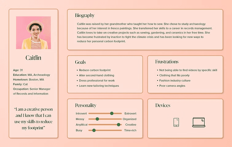
Caitlin is a creative professional who is handy with a sewing machine who needs to learn how to alter second-hand clothing well because she works in a professional setting with a dress code but knows that the fashion industry is environmentally problematic.
Pain Points
Time
Creatives are not always time rich and need to be able to find what they're looking for quickly.
Architecture Information
Platforms don't offer many ways of sorting and filtering through tutorials and rely on keyword searches that do not always return the best results.
Information
Platforms do not always offer a fully immersive learning experience.
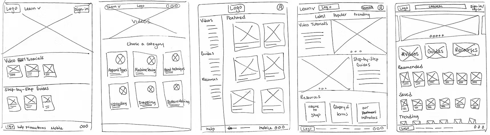
I took the time to sit down with a pen and sketch pad to draft many iterations of the home screen, the video interface, and the navigation options. This ensured that elements addressing user pain points would make it into the digital wireframes. For the home screen, I prioritized thinking of ways to organize the different tutorials, referring back to my user interviews for how users want to find information.
Once I had decided on page elements that met user needs, I transitioned to digital wireframes using Adobe XD. I used Gestalt principles such as similarity, proximity, and common region to clearly represent my designs. While considered a bit outdated by many in the UX field, I decided that the site would need to have some elements of a Matrix structure though the site is mainly a hierarchal structure. The Matrix allows users to follow their own path while searching for the perfect tutorial for their project.
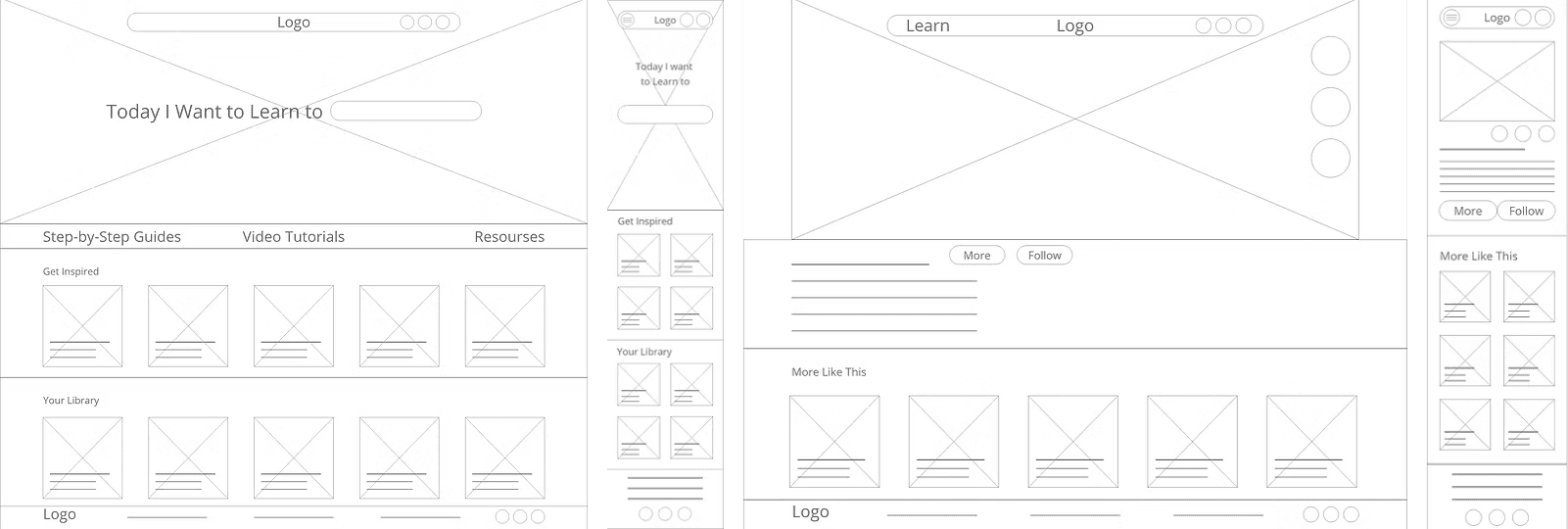
I used Adobe XD to create a low-fidelity prototype using digital wireframes. The primary user flow that I connected is for a user searching for one specific video tutorial by choosing to search by video tutorial then by category. Next, the user refines their search by apparel type, difficulty level, and tools used. The user can then select the video that best matches their project and they can save the video using their Sewing Social account.

I conducted an unmoderated remote study of five participants. Each session was approximately 30 minutes long.
Once users have found the tutorial that they are looking for they would like to be able to search for more content by the user who uploaded the video.
Users want to be able to filter and sort based on difficulty level.
Users want to easily toggle back and forth between videos and step-by-step guides without having to re-start their search.
Based on insights from the usability study, I made it easier to change from searching for a video to searching for a guide.

Based on feedback from users, I added a section to the video page to include content by the creator of the video.
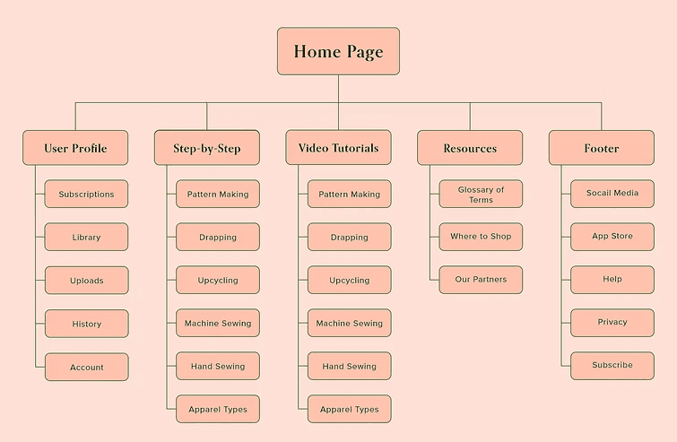
The main structure for the website is hierarchal because this is the structure that users have come to expect. Because users of the site expressed that they visit tutorial sites already knowing what they are looking for, the website also has some Matrix structure aspects. I divided the material into two main categories, Step-by-Step Guides and Video Tutorials then group the learning resources into six main subcategories which can be filtered and sorted. I also added a button that allows users to jump between the guides and tutorials that maintains the filter and sort criteria already inputted by the user.

I chose a palette of warm colors that are rich and cozy feeling. I wanted colors that were both invigorating to get users' creative flowing but could also fade into the background and not be a distraction to the learning experience. I also wanted a palette that would be identifiable as the Sewing Social brand. I combine to typefaces, one serif on sans serif when choosing my typography.
The designs for screen size variation include mobile and desktop. I optimized the designs to fit specific user needs of the two device screen sizes.


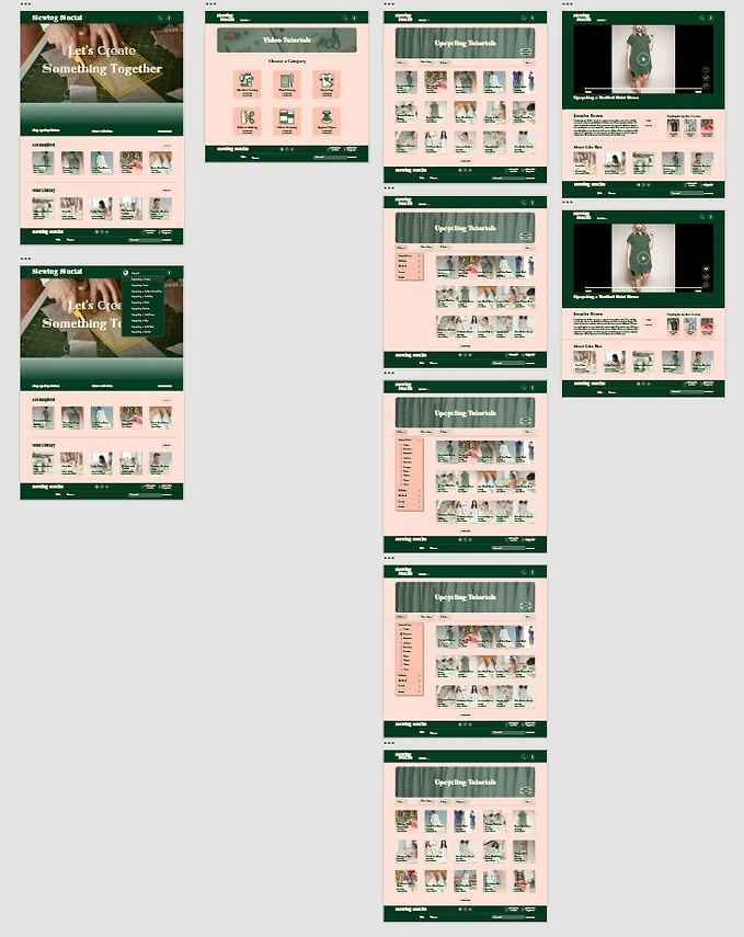
The high-fidelity prototype follows the same user flow with design updates made after the usability study. Visual design elements such as color palette, typography, and shape design were added.
The challenge for this project was to design a site that allowed users to search for a learning resource for a specific sewing project. Because the number of videos and guides is quite large, searching through them could overwhelm the users. I set out to organize the resources in a way that allowed users to quickly find something very specific. Users of educational resource websites generally know what they are looking for when they arrive at the site but these websites are often structured in a way that promotes browsing. I knew that Matrix structures can be difficult to navigate but once I began to create categories and subcategories based on skills, tools, and project types the design really fell into place.
Conduct another round of research to find out if there are more ways to subdivide the resources to improve navigation.
Add additional educational resources for users to access and learn from.
Provide additional structure for the users who are visiting the site in search of inspiration rather than a particular project.