September - October 2021

Project Overview


The Product
Waste Not is a New York City-based organization focused on reduing food waste in the community. The organization needs a tool to help consumers reduce their food waste. The target audience includes adults of all ages looking for ways to reduce their own food waste and learn more about food waste in general
The Problem
Approximately 3.9 million tons of food waste from New Yorkers end up in landfills each year while 13.5% of New Yorkers report food insecurity. Many New Yorkers lack the knowledge of existing resources to reduce waste within their city.
The Goal
Design a dedicated mobile app and a responsive website that will help the community to reduce their food waste by focusing on educating users and connecting them to their community.
User Research
I developed interview questions based on data about food waste in New York City. Interview participants were aware that they were wasting food and felt badly about this. Many lacked general information about ways to reduce their waste and some expressed frustration that there were not more options to support their efforts to reduce waste within their city. This feedback made it clear that users are willing to try to reduce their own waste and want a tool that provides both education and resources.
Personal A: Raquel
Raquel is a home cook who needs to learn what to do with food scraps because she does not want them to end up in a landfill.


Persona B: Cory
Cory is new to cooking and needs to learn good food buying habits because he does not want to produce more waste.
Starting the Design
Ideation
I did a quick ideation activity to focus my thoughts and get some ideas down on paper. Most of my ideas were focused on reducing waste in the kitchen while others were about providing users with resources in their community.
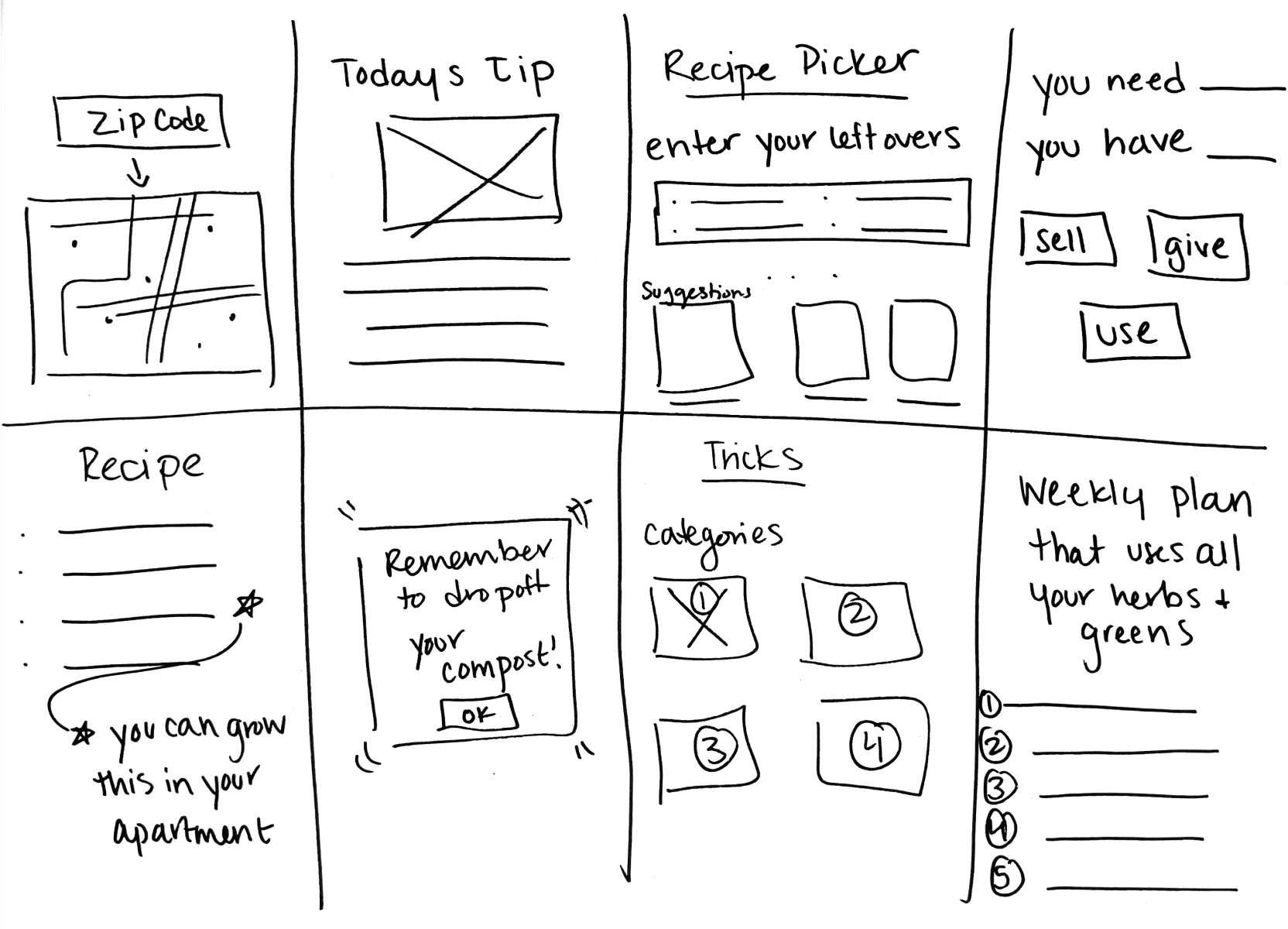

Wireframing
After drawing paper wireframes, I created initial digital wireframes using Adobe XD. These designs focused on creating an easily navigable flow that addressed main user needs.
Low-Fidelity
Prototyping
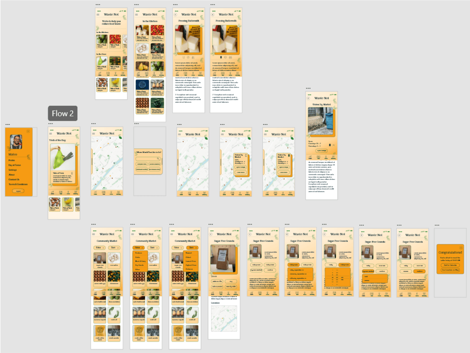
To prepare for user testing, I created a low-fidelity prototype connecting the user flows for searching for compost location, looking up food waste reducing tricks, and the flow for buying leftover greens from a neighbor.
Check out the mobile app low-fidelity prototype here!
Usability Study
I conducted an unmoderated remote study of seven participants. Each session was 30 to 60 minutes long.
Users want more information about sites on the map and would like to access directions to the location
Users want to be able to filter and sort through the different types of Tricks to Reduce Food Waste.
Users want a simple and straightforward calendar option and the ability to connect with sellers directly
Insights
Basted on the insights from the usability study, I made changes to certain features within the prototype such as a link to more information about a location on the map and a link that will direct users to the map application on their mobile device.

Based on the theme that some users wanted more filter and sort options when searching for tricks, an insight is users should be able to filter tricks. I sorted the tricks into categories and added a filter and sort button.
Some users felt that a full calendar was overwhelming, I designed a drop-down that offered users more limited selection of dates that would be set by the seller of the product.
Mockups and High-Fidelity Prototype
Style Guide
I chose colors that invoked the idea of a bountiful harvest. Shades of warm orange and crisp green are present throughout the design and call to mind the idea of a rich feast. Reducing food waste does not mean reducing enjoyment. I chose a serif typeface, List Text, for the headings and paired it with the san-serif typeface Degualar Text.

Accessibility Considerations
Contrast ratios were checked for all colors to ensure that Web Content Accessibility Guidelines were met.
Clear labels were included for interactive elements that can be read by screen readers.
Repeated components appear in the same order throughout the mobile app for consistent navigation.
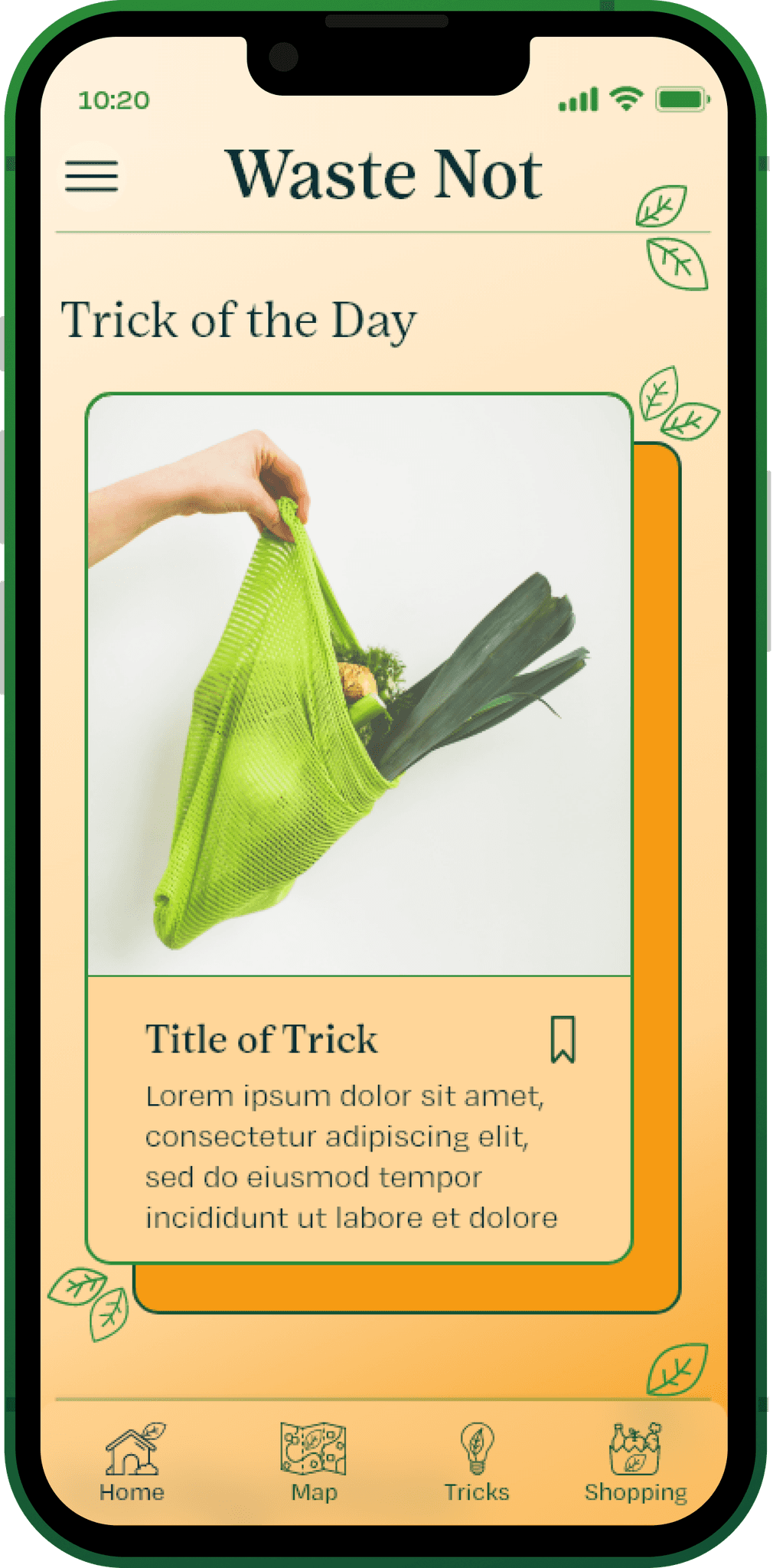
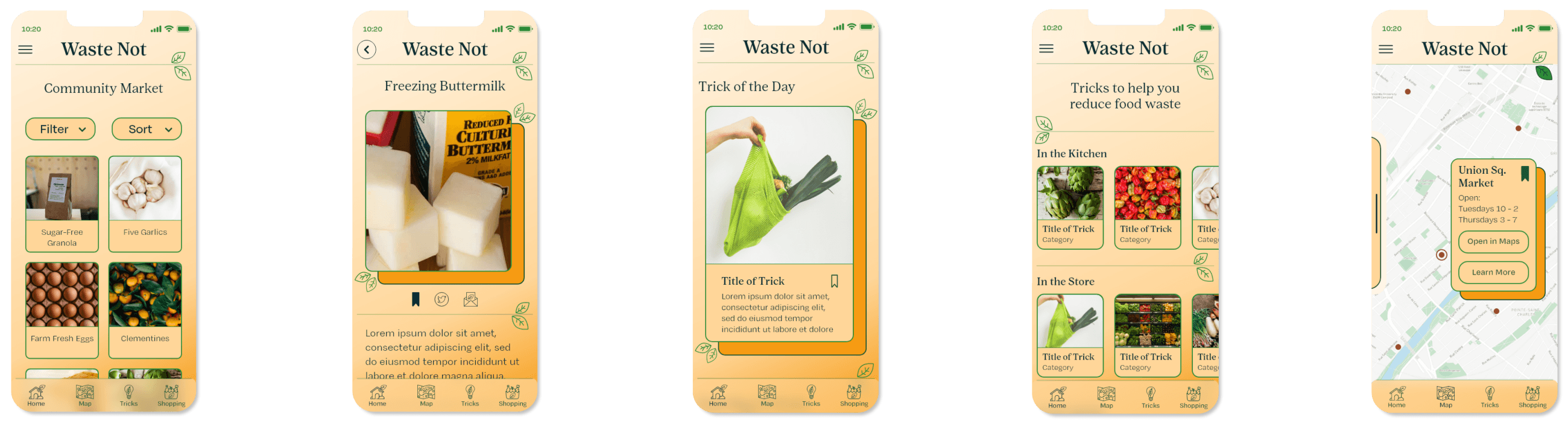
High-Fidelity Prototyping
The high-fidelity prototype follows the same user flow as the low-fidelity prototype. Design updates were made after the usability study. Visual design elements such as color palette, typography, and shape design were added.
Check out the High-Fidelity Prototype for the mobile app.
Responsive Design
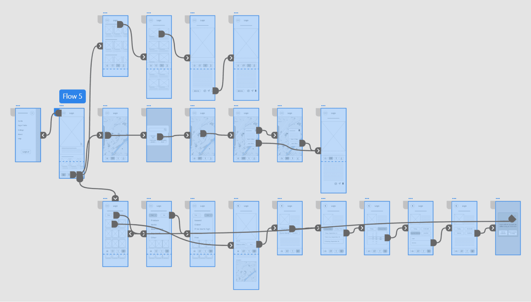
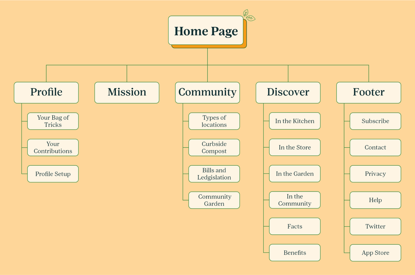
Sitemap
Once the designs for the dedicated mobile app were completed, I began working on the responsive website for Waste Not. The website has more in-depth educational information as the users are more likely to access longer articles on their desktops rather than on their mobile devices. The website also includes the map of community recourses along with information about getting involved in the user’s community.
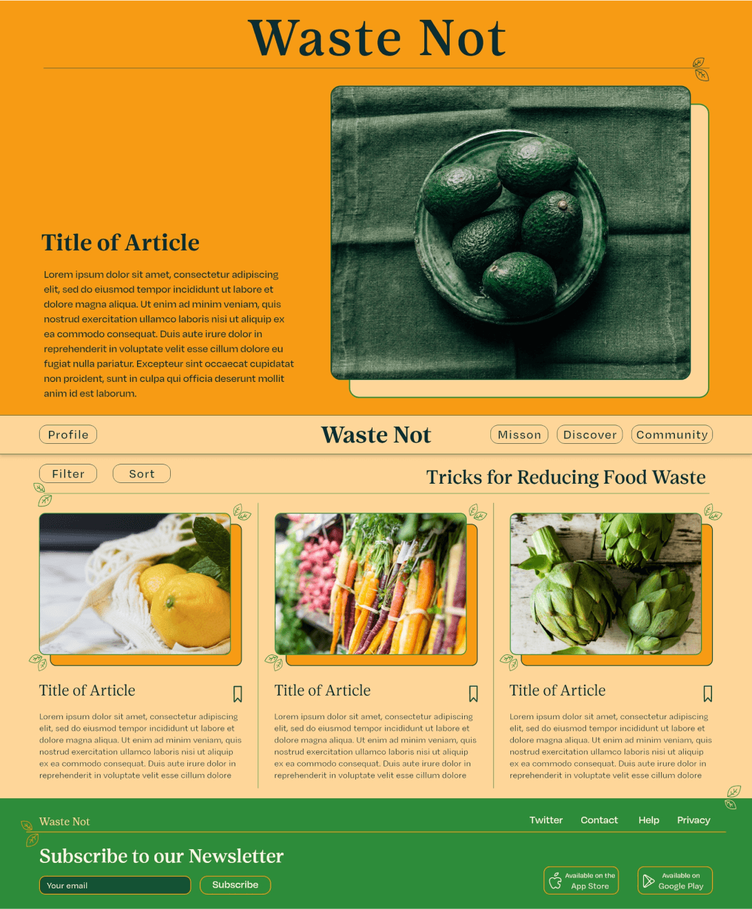
Responsive Website
The designs for screen size variations include mobile and desktop. I optimized the designs to fit the specific user needs of these two screen size types.
High-Fidelity Prototyping
The high-fidelity prototype for the responsive website follows the user flow outlined in the above site map.
Check out the high-fidelity prototype for the website here!

Animated Website Experience
Click play to watch the game be played!
What I Learned
At first, the problem that I was tasked with solving seemed very big. Once I broke the project down into parts and began to speak with users I realized that there were some specific user needs that overlapped, thereby making the problem more feasible to solve
Conduct another round of research to find out how successful he app is at the goal of reducing food waste.
Add additional educational resources for users to access and learn from.
Provide reminders for users to complete certain tasks and link the app with the preferred calendar app ont he user’s mobile device.