April 2021 - June 2021

The Brooklyn Art Gallery is looking to create a new app to make art buying more educational, interactive, and accessible. The gallery exhibits modern and contemporary artworks and is looking to expand its audience.
Art lovers and collectors cannot always visit the gallery in person and are looking for a more educational experience.
Design an app for the gallery that allows users to engage with the art while at home, and make purchases, appointments, and inquiries directly from the app.
I conducted interviews, built empathy maps, and identified user pain points to understand the users’ needs. I identified a main user group through this research; art lovers and gallery visitors who want more ways to learn about modern and contemporary artists.
This user group helped confirm my expectations about the gallery’s visitors. The research revealed that not just collectors but also lovers were looking for a more educational experience. Other user problems identified included busy work schedules, accessibility, and not always feeling welcome in galleries as casual art lovers.
Maggie is a lover of art and art education who needs To know info about artists before she visits a gallery because It makes her visit more enjoyable when she is well informed.

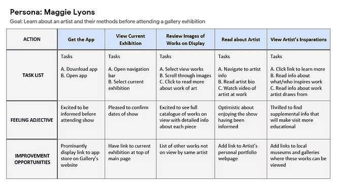
Mapping Maggie’s user journey revealed how helpful it would be for users to be able to engage with the art and artist.
Pain Points
Time
Art lovers cannot always visit in person or stay long when they are at the gallery.
AI
Platforms are often e-commerce focused or designed for in-person-only educational experiences.
Information
Platforms do not always offer a fully immersive learning experience.
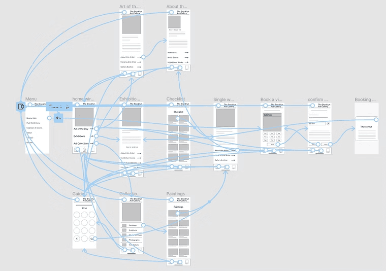
Taking the time to draft iterations of each screen of the app on paper ensured that the elements that made it to digital wireframes would be well-suited to address user pain points. For the home screen, I prioritized links to the most visited screens within the app to help users access the recourses they would be looking for quickly.


As the initial design phase continued, I made sure to base screen designs on feedback and findings from the user research.
Easy navigation was important to create an app that both supported eCommerce and educational aspects.
Including educational information was important to support the needs of both collectors and lovers of art.
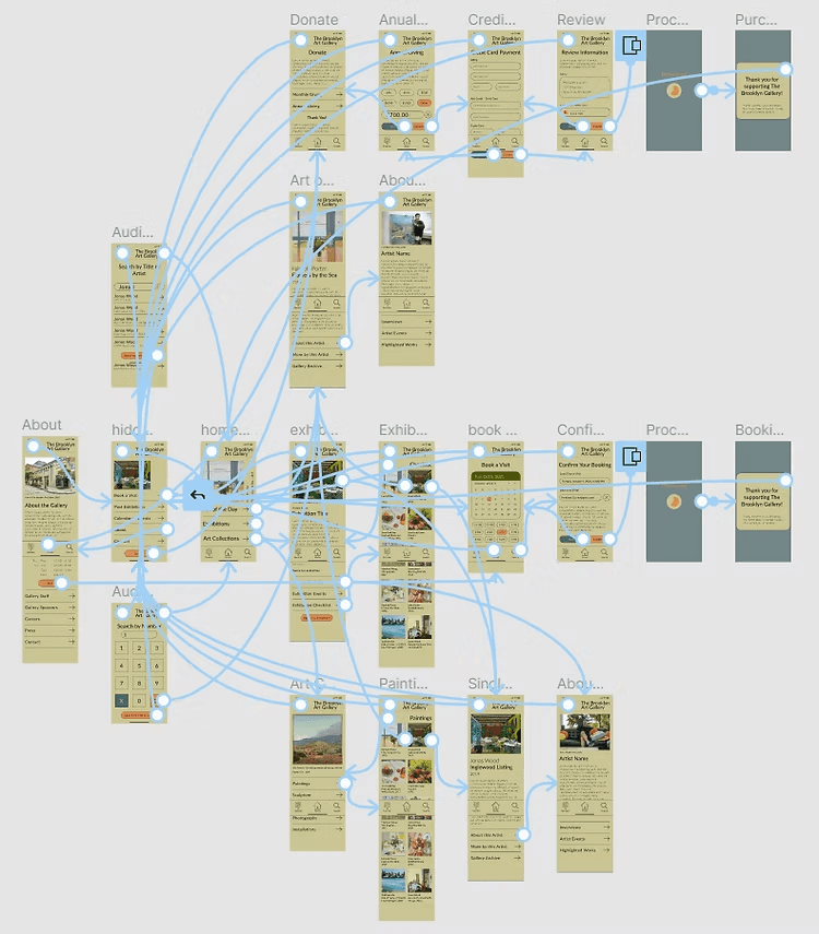
I used Figma to create a low-fidelity prototype using the digital wireframes. The primary user flow that I connected was submitting an inquiry through the app to the gallery by navigating to a single work of art page from different pages within the app so that I could use this prototype in a usability study.
I conducted two rounds of usability studies. The first study used the lo-fi prototype. Findings from this first study helped inform design decisions when creating mockups. I used these mockups to create a hi-fi prototype which was used in the second round of usability studies. The second round helped show what aspects of the mockups needed refining.
Round 1 Findings:
Users wanted a quicker way to book a visit.
Most users wanted to search the collection by category.
Some users could not find the educational content for the artist.
Round 2 Findings:
Users want to easily transition from searching by guide number to searching by keyword.
Users want to submit inquiries directly from their phones.
Users want to access information about the shop from the app.
Insights
Users who are looking to learn about a work of art or an artist from their home want to easily toggle between searching by audio guide number and searching by keyword. Both tools are on the navigation bar. I added a button at the bottom of both screens allowing users to toggle back and forth without having to return to a main screen.
Users were unsure where to find videos, interviews, and events with featured artists. I removed the word "engage" and replaced it with two pages, one with interviews and one with artist events.
Users wanted to be able to book a visit without having to navigate through the exhibition screens. I added the option to book a visit in the hidden menu so that users can book a visit from any point within the flow.


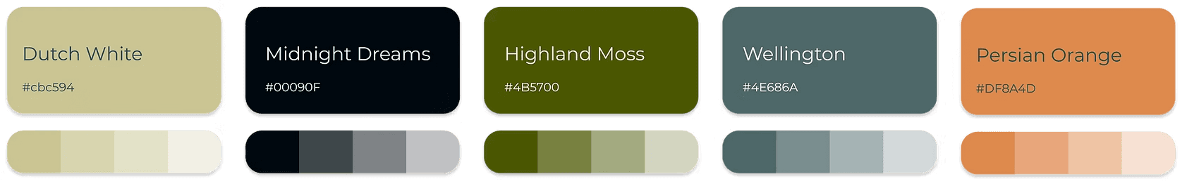
I chose a modern color palette, pulling individual colors from works of art featured at modern and contemporary art galleries. The colors are warm and rich. I used a single typeface to use throughout the design. Lato is a humanist sans-serif typeface with a professional yet welcoming mood.
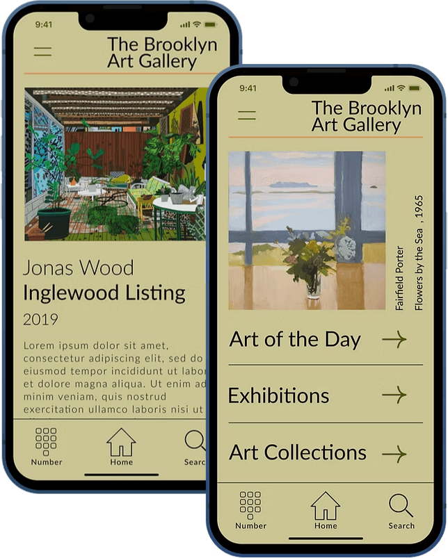
In the high-fidelity prototype, I added confirmation pages for inquiries, appointments, and payments so that the user knows they completed the task correctly. I met user needs by making the user flow clearer.
Check out the High-Fidelity Prototype for the mobile app.
The app allows users to feel a closer connection with the works of art by offering the educational material users were looking for. My first ideas for the app could have taken many directions, as I iterated on my designs I tried to stay focused on the challenge of making the app educational. This helped keep me on the right path.
Conduct another round of research to find out if user pain points have been effectively addressed.
Provide a way for the app to get to know user preferences to alert the user to shows or works that they may be interested in.
Offer a way to collaborate with gallery curators to offer a more personalized user experience.